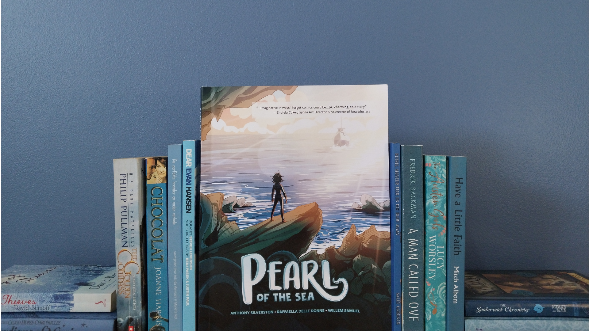
Pearl of the Sea - A Graphic Novel
Pearl of the Sea (2023) is South Africa's very own sea monster story and Triggerfish Animation Studio's first attempt in the graphic novel industry. Written by Anthony Silverton and Raffaella Dell Done, it touches on social issues relevant to South Africa, but also raises universal questions of being vulnerable, forgiveness and who the real monsters are.
Illustrated by Willem Samuel and inked and coloured by Jessi Ochse and Clyde Beech, the team at Triggerfish Animation Studio does an excellent job at showcasing beautiful coastal villages in their graphic novel and captures unique expressions characteristic to South Africa.
The story
The story centers around a teenage girl named Pearl who lives with her father, Vernon, in a small fishing village located somewhere on the western coast of South Africa. Abandoned by her mother and struggling to fit in at school, Pearl escapes to the ocean, because out on the water she can just be herself and break free from her daily problems.
This sanctuary, however, is threatened when her father announces that they'll be moving away. Due to the high rate of unemployment in their village, he is forced to look for job opportunities in the city. This acts as the central conflict that motivates Pearl to team up with a group of abalone poachers. She is determined to do anything to earn money and prevent them from moving away, because secretly she is still waiting for her mother to return to them one day.
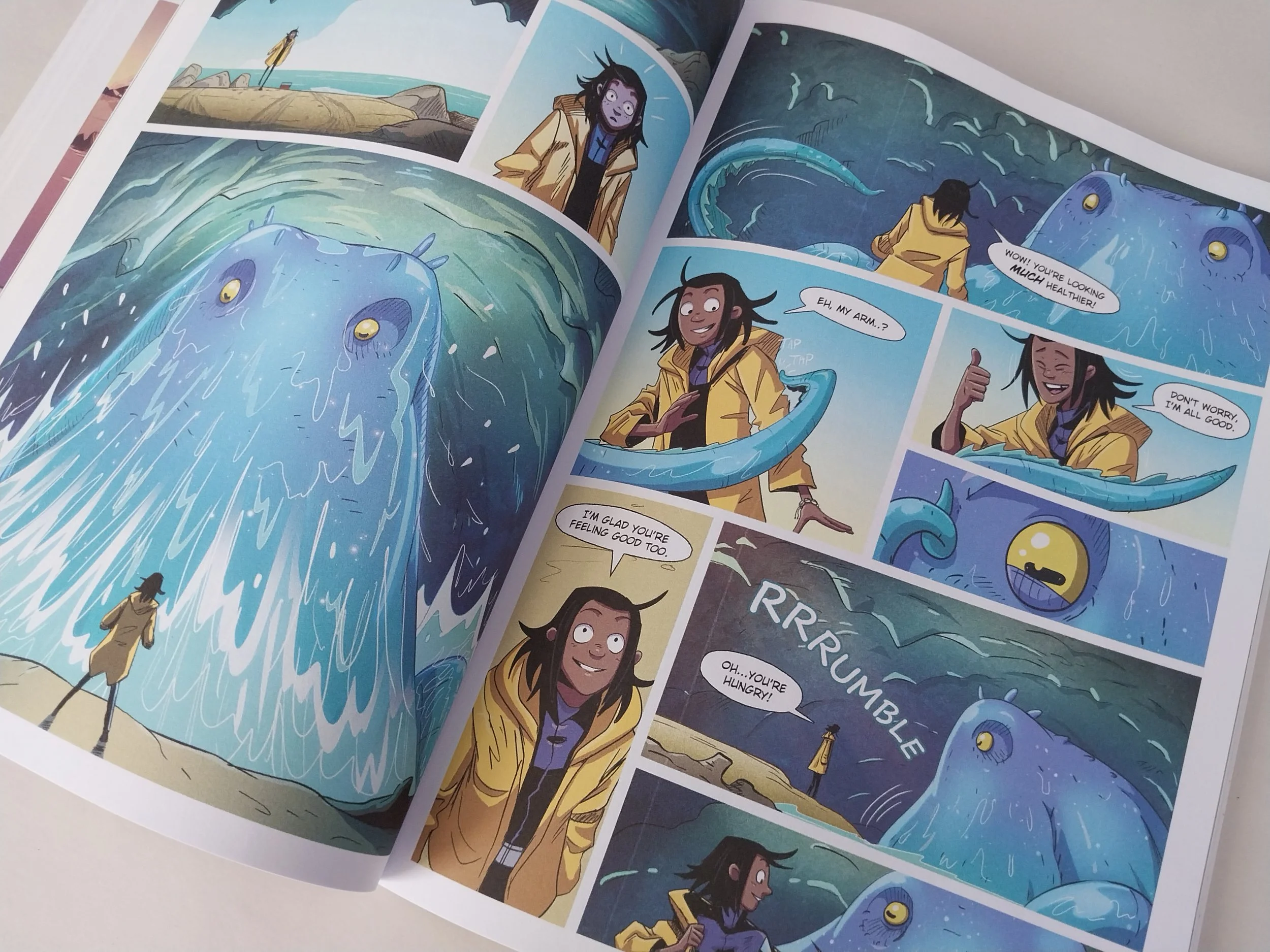
While diving for abalone near a restricted wreck, Pearl's known world gets thrown upside-down when she discovers an ancient sea monster called Otto. Meeting Otto helps Pearl lower her walls and open-up her shell, enabling her to trust again. Which ultimately leads her to forgiving her mother and letting go of the past.
How it started
The idea
The idea for Pearl of the Sea started with the idea of a sea monster. Raffaella Delle Donne got the idea after seeing illustrations of sea monsters that were supposedly a visual representation of European sailors' first-hand accounts of encounters with unknown marine animals. She wanted to write her own version of a sea monster story with all the classic monster tropes, but have it situated somewhere in the South African landscape.
Donne wanted the story to show how humans are the true monsters. By using this European literary trope in a post-colonial South African setting, she also wanted it to comment on the effect that colonization had and still has on fishing villages like the one in which Pearl and her father live.
Writing the movie script
Raffaella Delle Donne approached Anthony Silverton (Triggerfish's Creative Director) with this idea, originally intending for it to be an animation. Since he grew up in Kalkbay, a small fishing village at that time, Silverton felt a strong desire to be part of Donne's project. However, he knew that he had to find something personal of his own to add to the story in order for him to fully engage with it. That is how Pearl was born.
Changing the title of the graphic novel from 'Sea Monster" to "Pearl of the Sea" made their story more than just a traditional Europeanized monster story taking place in South Africa. It changed it to a friendship story between a 'monster' and a girl. Furthermore, the metaphor used in the title encapsulates one of the core messages within the graphic novel - the importance of opening up and being vulnerable.
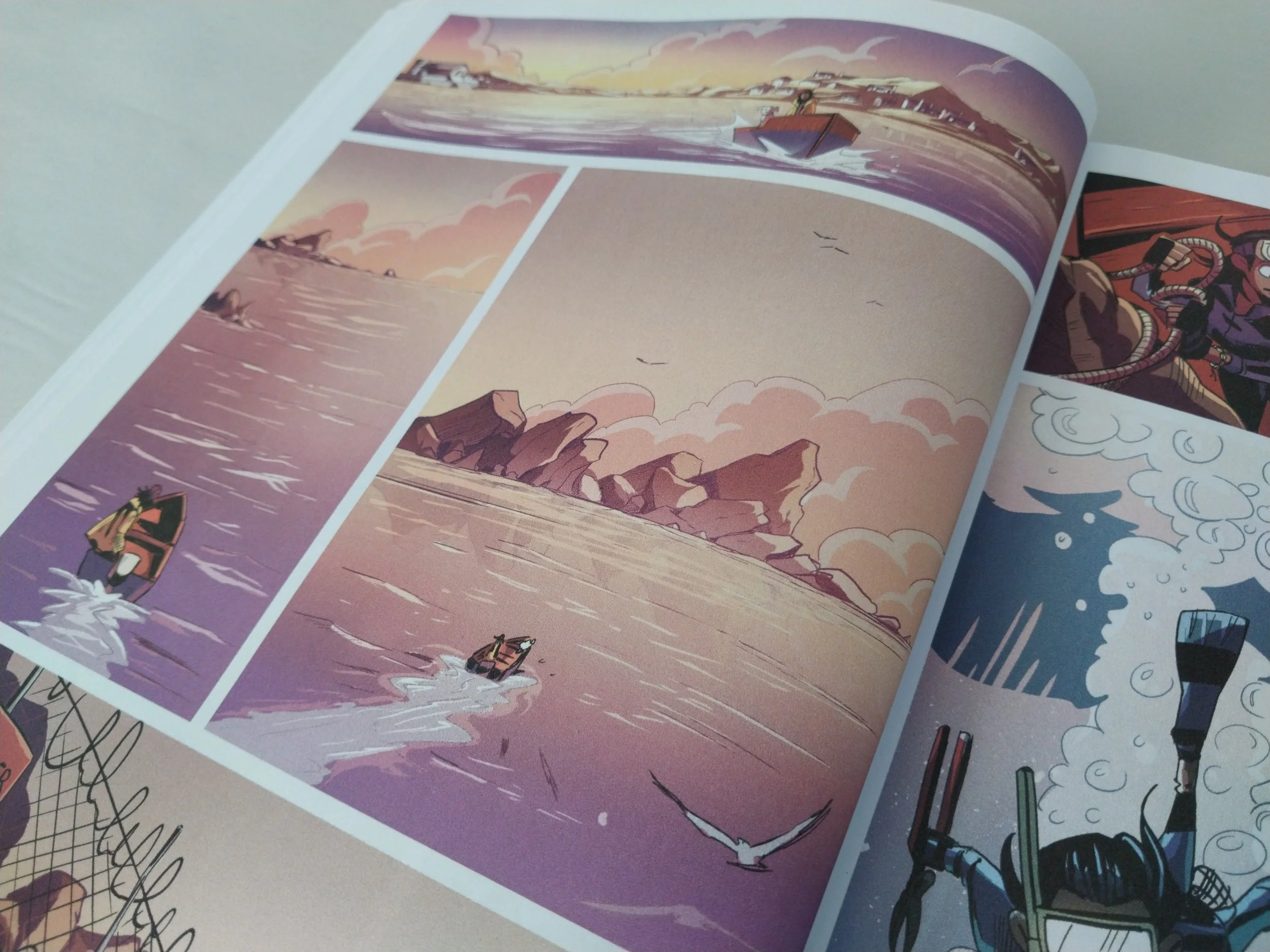
Pages 80 and 81 from the graphic novel, Pearl of the Sea
Just like an actual pearl, the main character hides away from the world in her shell - which takes the form of the ocean! As the story progresses, Pearl learns to lower her barriers and invite people into her shell where they can see her true self. By allowing others to enter into her sanctuary and revealing her vulnerabilities, Pearl is able to truly connect with others.
Even though both Donne and Silverton brought their own unique message to the story, it was important to both of them to convey and showcase the beauty of the South African fishing community without overly romanticizing them. They wanted to acknowledge and show that these fishing communities are still struggling with the aftermath of apartheid.
However, as they started writing Pearl of the Sea as an animated featured film, with the target audience being children, they were unsure how to balance both the beauty and hardships of these communities. Luckily, circumstances steered them into the direction of a graphic novel, which opened a whole different type of visual storytelling to them.
Converting it into a graphic novel
This is when Anthony Silverton approached visual artist, Willem Samuel, to bring him onboard as the main illustrator of their project.
They worked through the whole script, doing rough versions of each page and rearranging the layouts of the panels to ensure they found the desired pace at which the reader should read the graphic novel. This was important to them, because the speed and order in which someone reads the graphic novel will determine how the story comes across and how it makes the reader feel.
In a film the director has more control of this than in a graphic novel. They can 'force' the viewers to linger on a character's face for a certain amount of time, revealing the character's reaction or emotions. They can also zoom in on something, give hints and lead the viewers to conclusions as they watch. But how would you do that in a graphic novel?
Movie elements
Interestingly enough a lot of the visual storytelling techniques used in this graphic novel are very similar to those used in films. It might be due to the fact that the story was originally written as an animated film or that it was directed by an Animation Studio's director.
Instead of using the traditional 'flat' side panel found in comics like Asterix and Obelix, Triggerfish Animation Studio uses a variety of dynamic shots, angles, compositions and editing techniques that are also very commonly used in the film industry.
For example:
Point-of-view-shots
3rd-person-point-of-view-shot
Tilted angles
Selective focus
Close up shots
Wide angle shot
Montage
Flashbacks
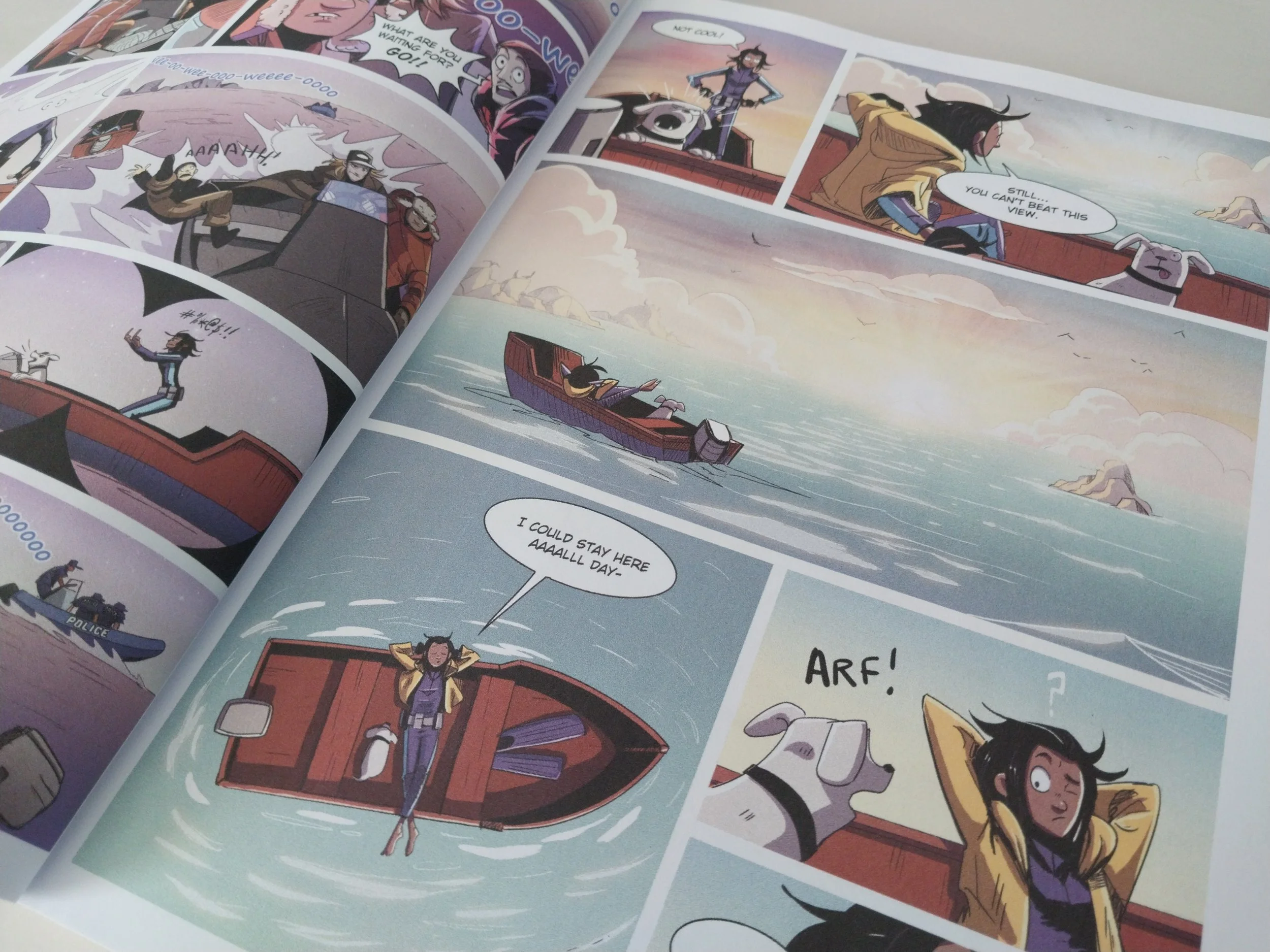
The sequence in which the illustrations are arrange give the feeling of movement and the passing of time. It feels like a series of continued shots from a film showing us how something is happening, instead of telling us what is happening through dialogue.
Dialogue and Visual Storytelling
The dialogue was added afterwards to emphasise and support the visual story told in the images. This makes the graphic novel lean heavily on visual storytelling, which emphasises Pearl's character as someone who mostly retreats inward and doesn't talk a lot.
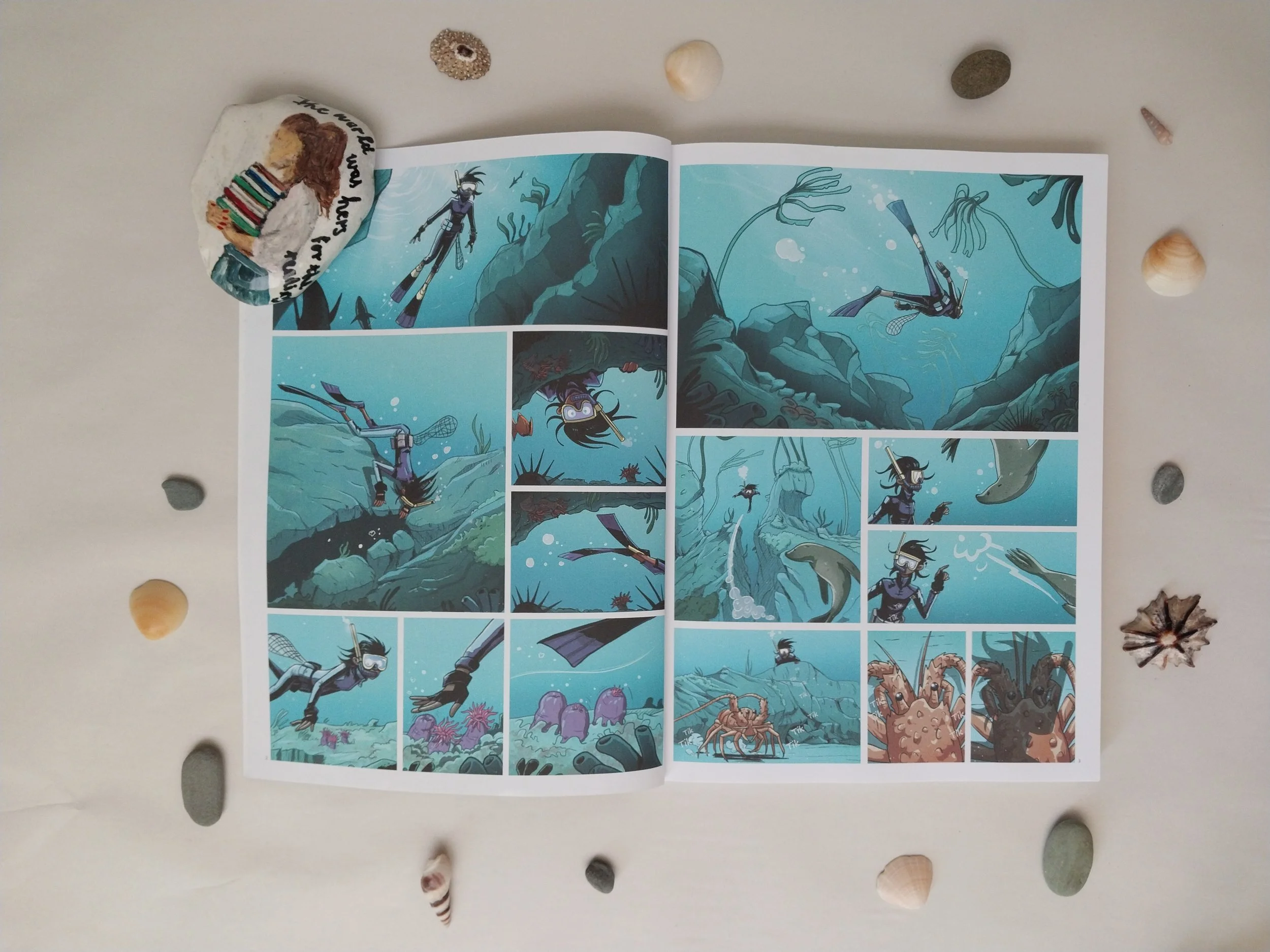
An excellent example of strong visual storytelling can be found in the opening scene of the graphic novel. It opens up to an underwater scene with an unknown figure swimming downwards. Around this figure we see a beautiful ocean scenery of fish, seaweed, coral and the rough rocky terrain.
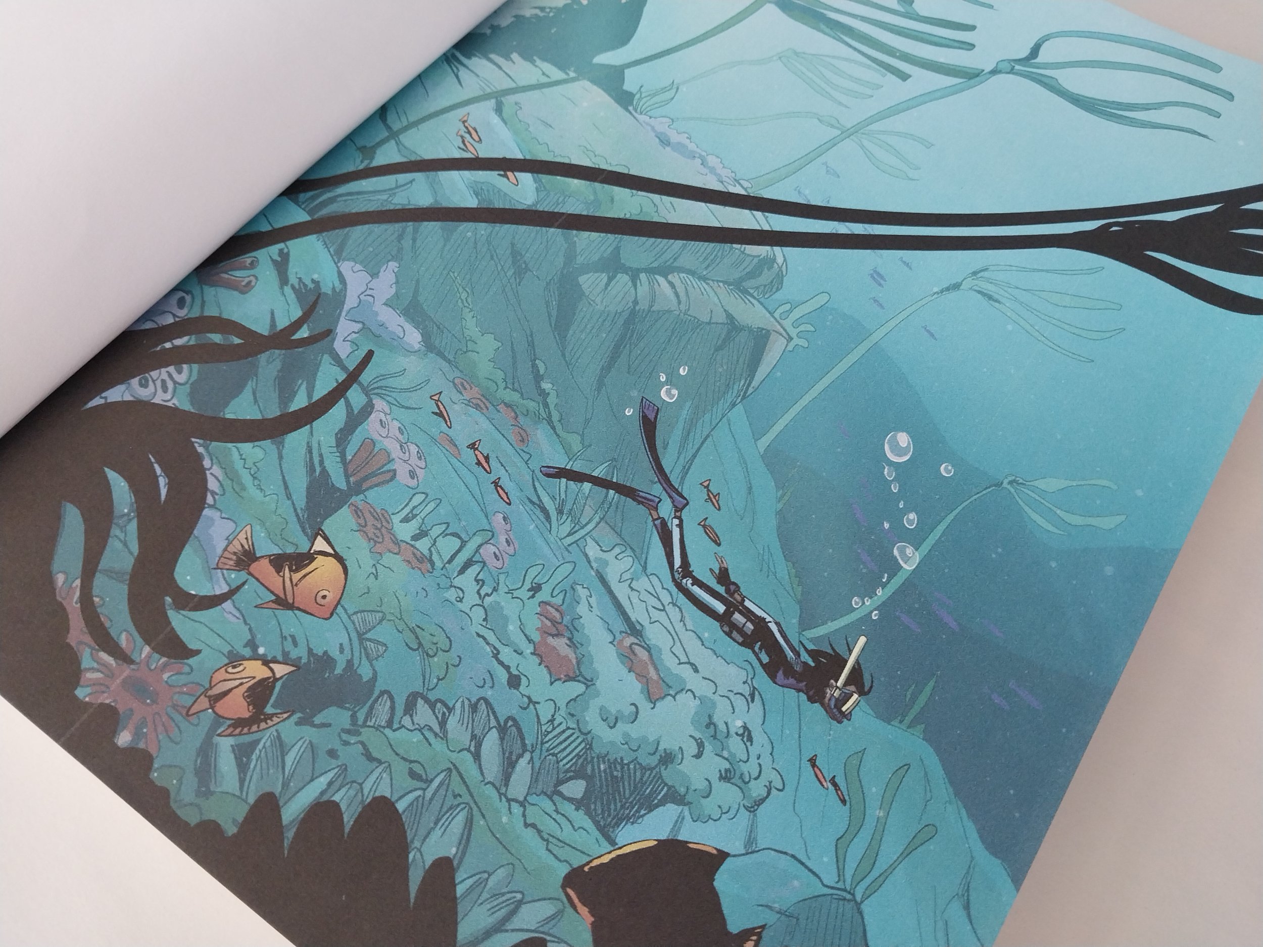
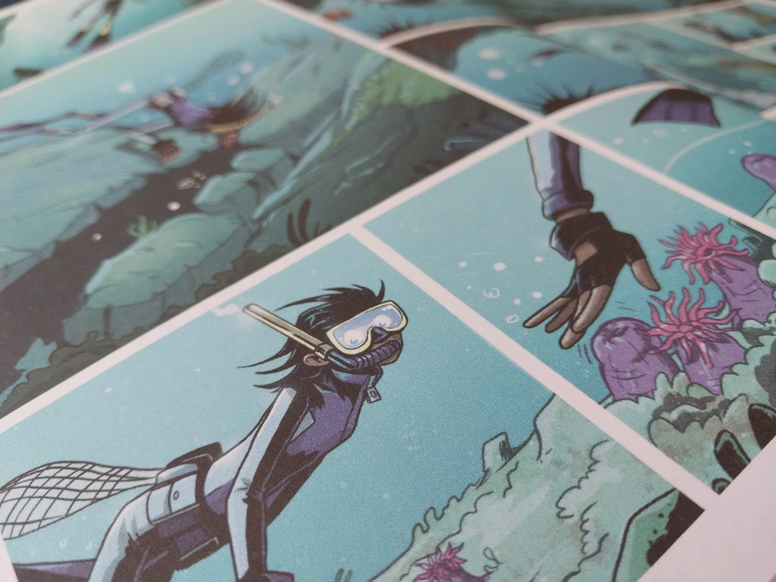
As we "swim" deeper with the figure, we realise they're looking for something and later we see that they're busy fishing for crayfish. It is only on page 8 that the reader finds the first piece of dialogue. This gives the reader time to learn more about the main character, who we only later learn is called Pearl on page 13.
In this opening scene the reader is already able to learn so much of Pearl's character! We see how conformable she is in the ocean. Her curiosity as she swims near a ship wreck and playfulness with which she interacts with the sea life. It is clear that Pearl isn't a poacher, because not once in this scene does she consider taking any of the abalone near the shipwreck. Showing that she only did it later out of desperation.
Use of Colour
Since the team wanted to use as little text as possible and couldn't rely on music as with films, their use of colour was extremely important to elicit the desired emotions form the readers. They also deliberately used specific colours to indicate what Pearl was feeling in different situations or at different locations.
For example, the colours used to illustrate the ocean scenes are beautiful, colourful and calm. In comparison to these colours, the dull brown and yellow colours used to illustrate the school tells us that Pearl doesn't like being there.
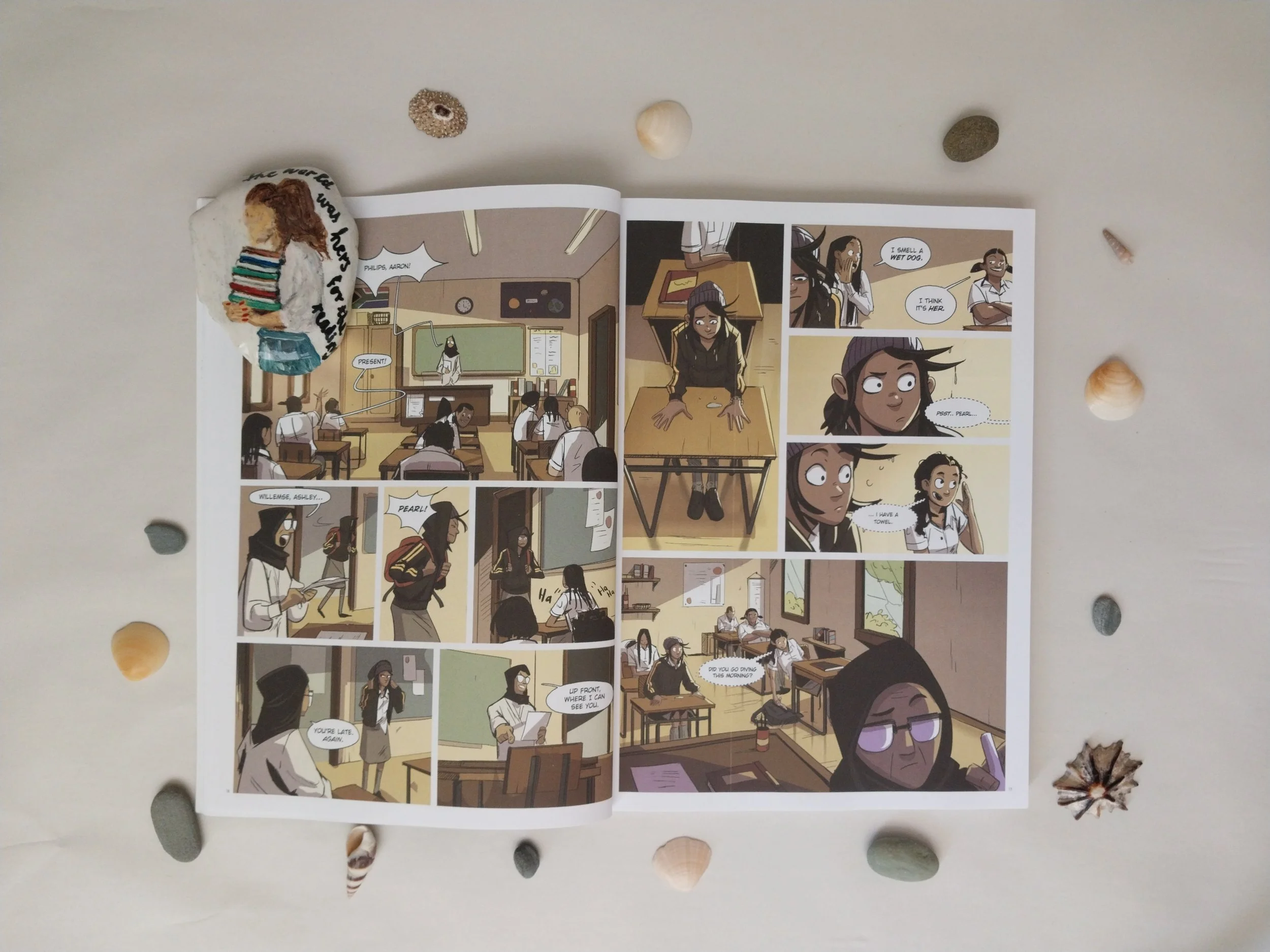
These contrasting colours gives the readers the ability to understand what Pearl is feeling without relying on music or dialogue to say it.
Visual Text
Through the use of these beautiful illustrations and vibrant colours the team managed to capture the beauty of South African's coastal landscapes.
They were also able to balance this beauty with the hardships found in the community by using little dialogue and visual text.
For example, on pages 12 -15 the reader sees Pearl running to her house - the beautiful coastal landscape always present in the background along with hints in the visual text and dialogue to signify that the story is taking place in a poor fishing community.
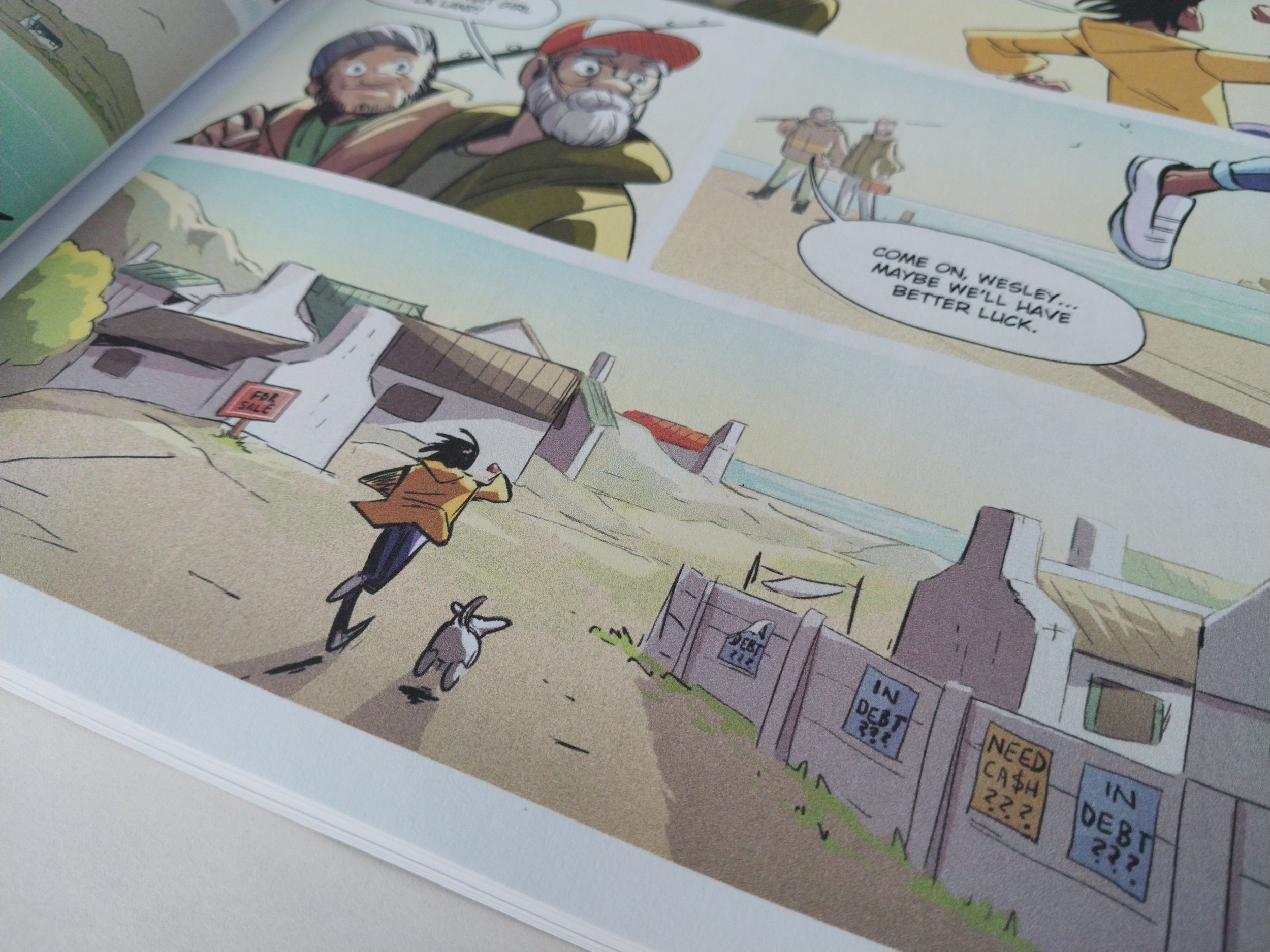
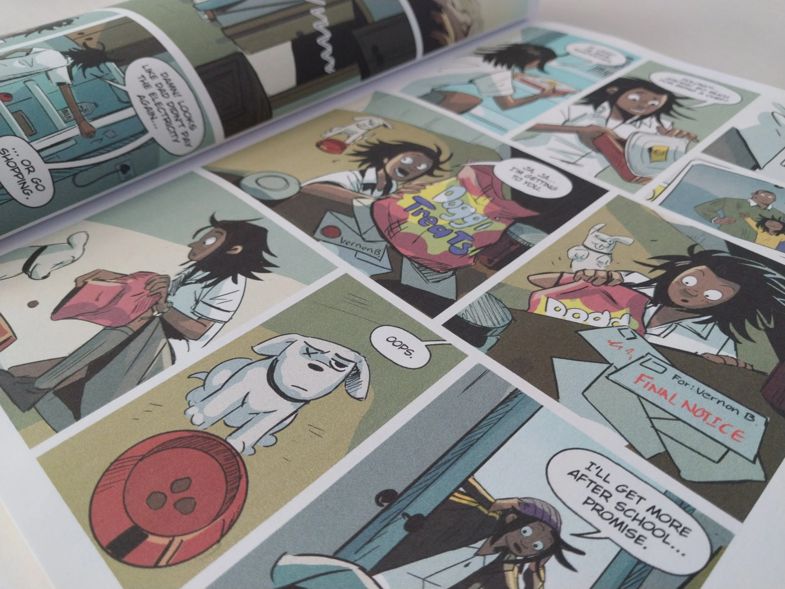
We see this in the "for sale" and "indebt" posters, the unpaid bills in Pearl's house and in her comment; "Damn! Looks like dad didn't pay the electricity again." This all ties into the subplot both Silverton and Donne feels very strongly about. That some of the contributing reasons for poaching in these fishing communities are due to the poverty left behind by the legacy of apartheid and joblessness due to commercial fishing companies leaving small town fishermen without an income.
In their interview with Cypress Publishing they expressed their desire to have had the opportunity to explore this topic even more. However, as this was not the main focus of the story the best they could do is to present the community in a truthful and realistic way that would hopefully spark curiosity in readers to find out more on the subject on their own.
Conclusion
I truly love this graphic novel. Finally we also have an epic tale of mysterious creatures living amongst us!
I especially enjoy how the team managed to show that contrasting things can co-exist. We can live in a country that has political, social and financial problems and yet still live in a beautiful country. The one does not exclude the other and this fills me with optimism that we can still make a difference.
Read more
I've you'd like to read more on Pearl of the Sea and the interviews I mentioned in the article, feel free to follow the links below: